Proceso: SÍMBOLO
Not long ago, our spiritual guide, Pedro Ajo came back to Barcelona. He paid us a visit at the ESTUDIO, and we discussed how he created the SÍMBOLO while he was still working with us here. Here’s an excerpt straight from our conversación:
GE (GOSPEL ESTUDIOS):
We’ve already talked about how you guys at A14M323 crafted the typography of GOSPEL ESTUDIOS. Could you walk us through the process of creation of the SÍMBOLO?
APA (Pedro Ajo):
The method was quite different from how we developed the cabala, which was something very rational. This, on the other hand, was more intuitive and aesthetic: Carlos and I initially explored typographic ideas that orbited around the same system, but ultimately, GOSPEL ESTUDIOS is a clothing brand, so we felt it was crucial for it to have a symbol to apply on labels, allover prints, social media—things like that. The final result was something built based on my intuition of what felt right and what didn’t, rather than on anything logical.
GE:
Do you recall anything specific from the process of creating it?
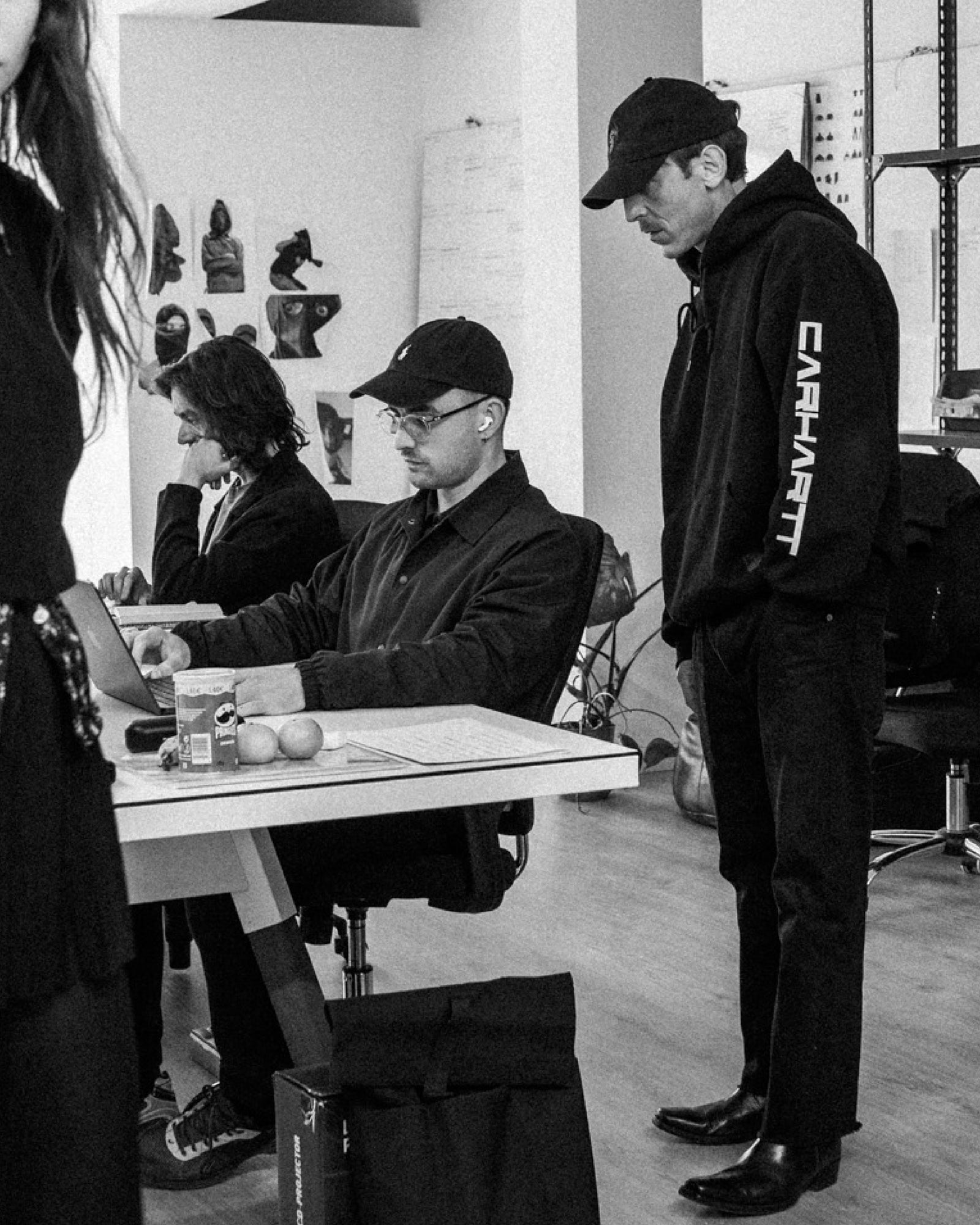
Pedro at the ESTUDIO
APA:
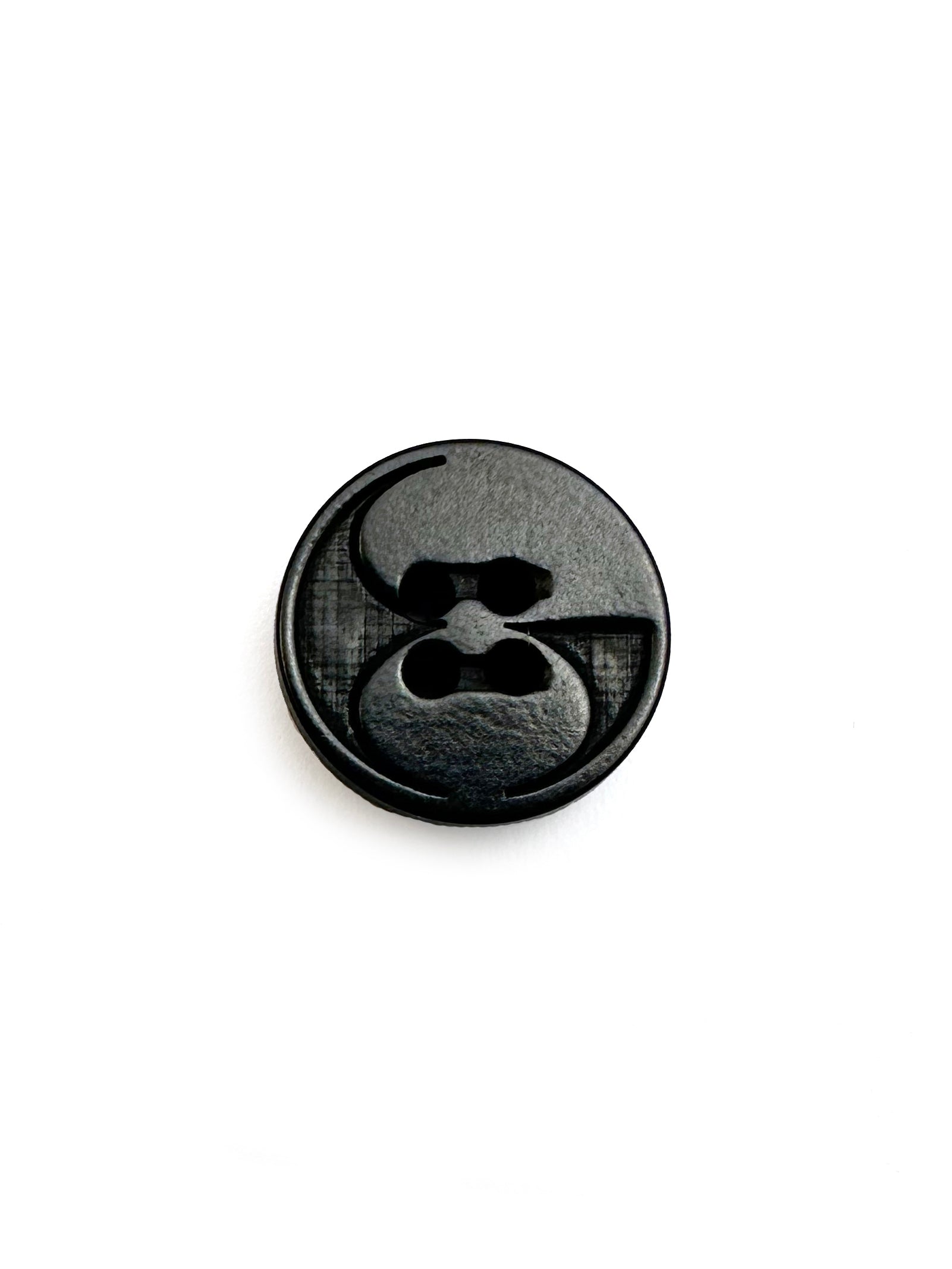
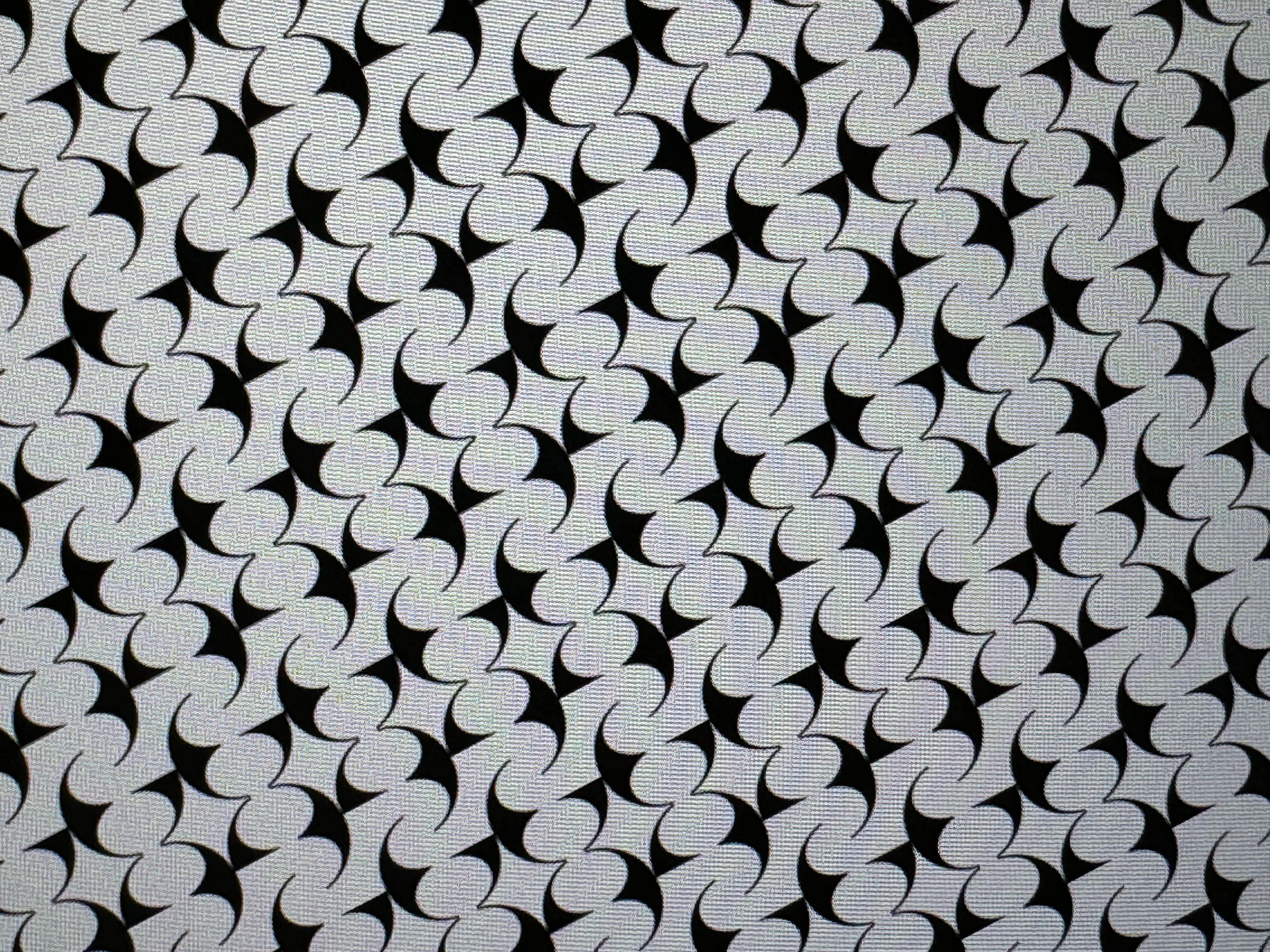
I remember that the tests that had to do with circles resonated more than those with squares, stars, and other shapes. We were also drawn to the difference between what’s visible and what’s hidden, which has to do with the mask—a central element in the imagery of GOSPEL ESTUDIOS.
Like the mask, the symbol plays with the idea of solid space versus empty space, light versus shadow, what is concealed versus what is shown.
But I feel like the justifications for it came later. The SÍMBOLO was the result of months of testing and playing with different shapes, and in the end, even the fact that it forms the letters G and the E feels almost accidental. Through trial and error, you often come across happy accidents and serendipities like that, that make everything come together and make sense.
GE:
Thank you so much, Pedro. Hearing about the ideas behind your design is always interesting for nosotros. We can only wish you suerte in your future projects.

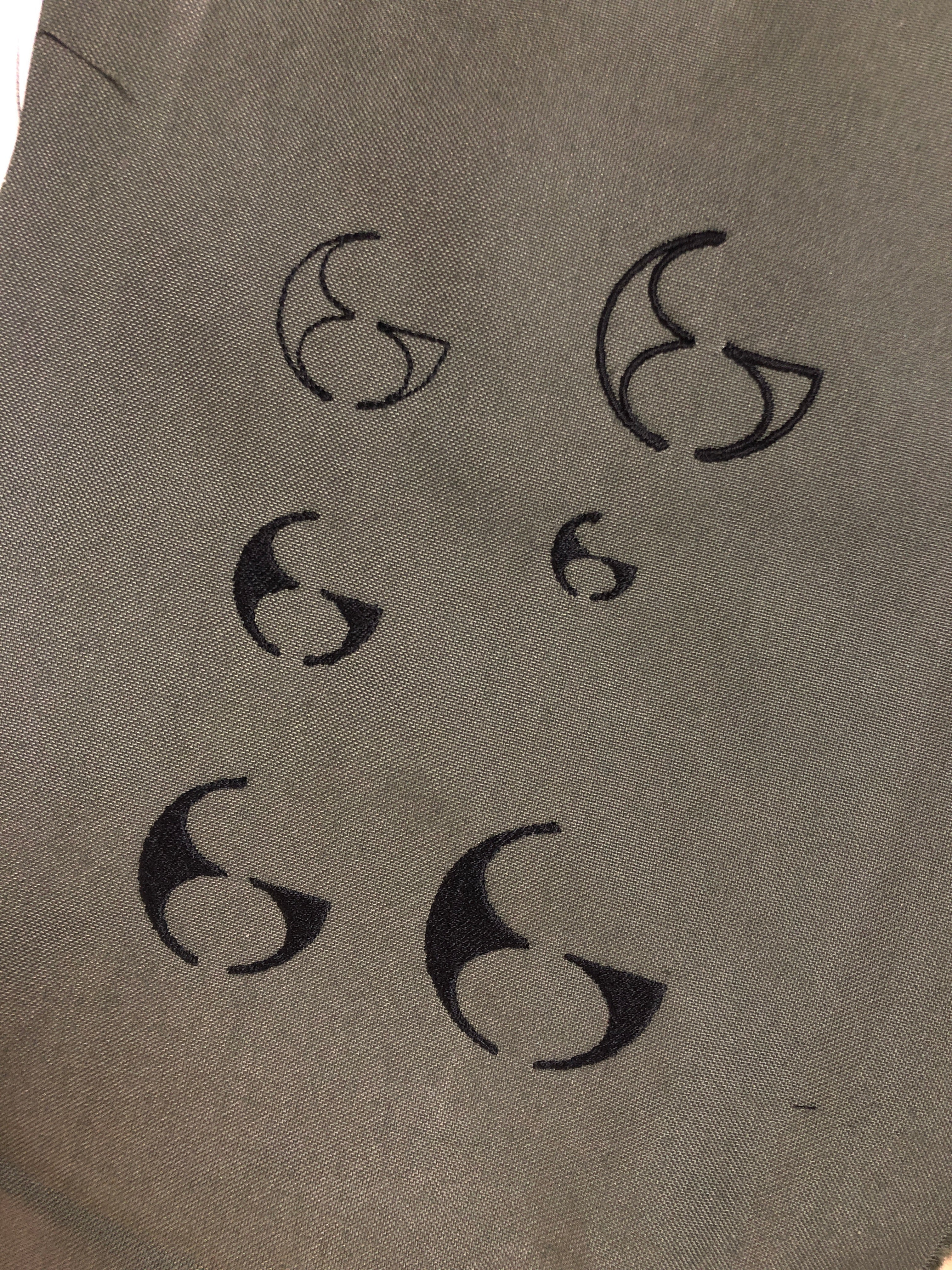
Inspo behind our SÍMBOLO

APA:
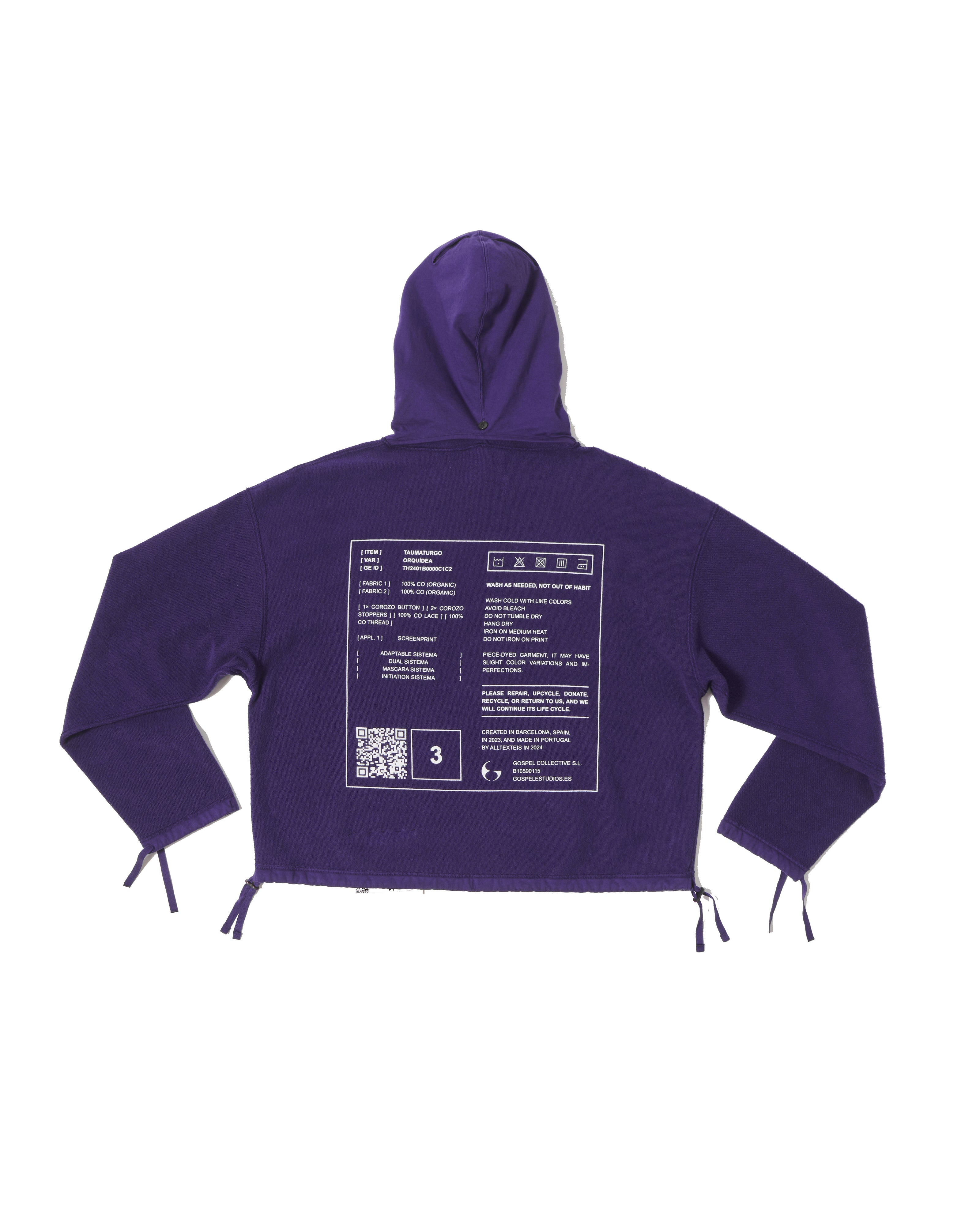
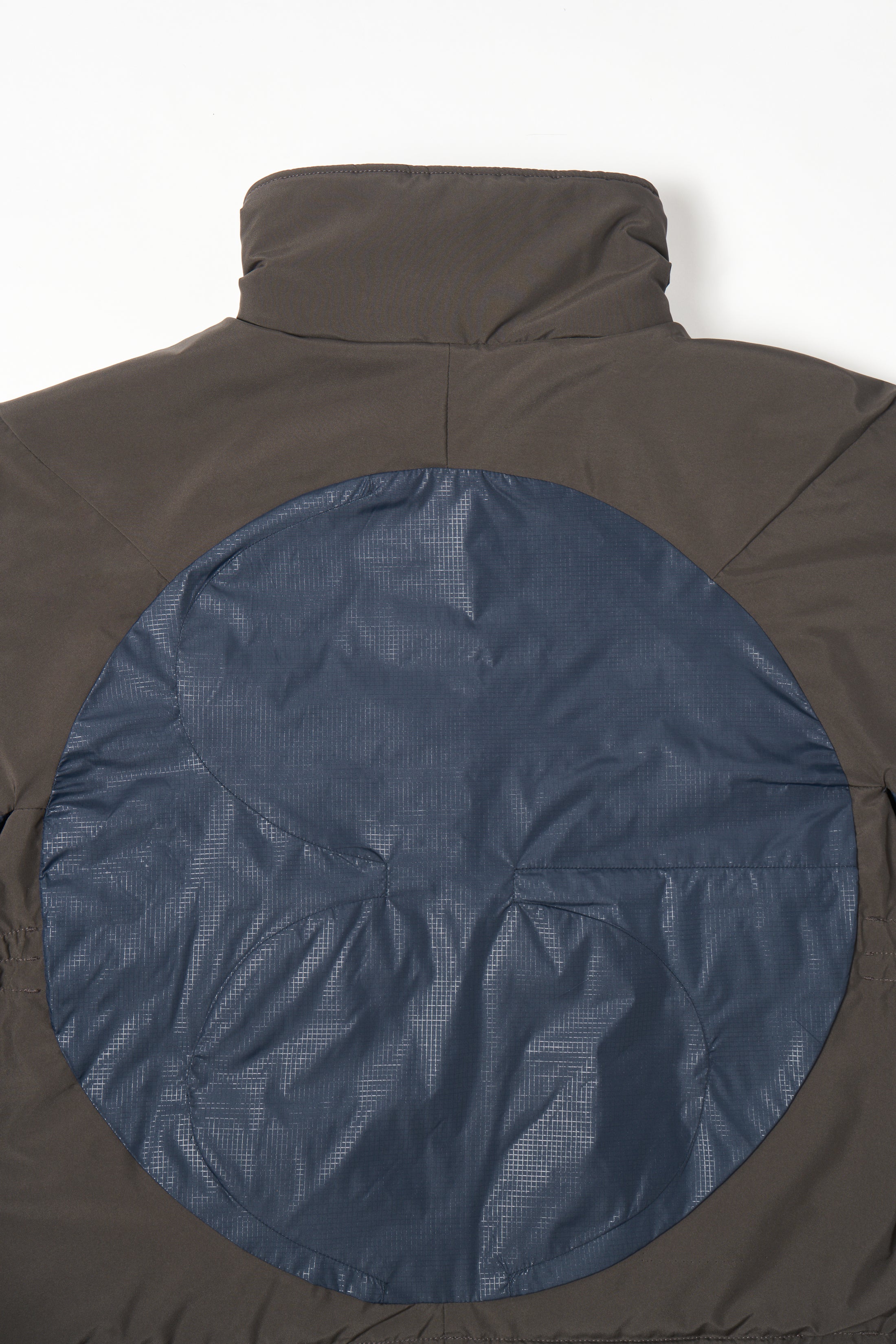
Thanks to you guys. It’s really fun for me to see the SÍMBOLO applied throughout—from the buttons on most garments to the pieces of the back panel of the JARAMAGO jacket.